STM: A User Centred Design Project
Navigating Through The Montreal Subway’s Mobile App System
Il y a un problème dans le métro, mais on ne comprend pas qu’est-ce que c'est!
Group members: Shaun Flippe, Hana Sambur, Jiayuan Wang, Siyao(Miranda) Zhang
The Montreal subway system is arguably one of the most organized in North America. That being said, newcomers who don’t speak French spend too long figuring out how to navigate through the system. Their phones also don’t seem to be much help, as there seems to only be third party map applications that show uninterrupted routes and nothing else.
We performed a user research and found that most newcomers who use smartphones have trouble properly navigating through their maps app. Consequently, they often miss trains or get on the wrong routes.
Based on this research, we concluded that a user-friendly design of the official STM app will incrementally help newcomers’ aptitude when using the metro.

Objectives
1. Design a STM app interface that provides real-time notifications from STM whenever there is an issue with trains en route
2. Design a STM app interface that prioritizes what users need the most when commuting with the Metro
Competitive Analysis
We picked 2 apps mentioned by interviewees in our user research
Our findings are as follows:
User Research
Target Demographics
Newcomers to Montreal who are between the ages of 20-35 and rely on mobile phones to navigate their trips.
User Interviews
We interviewed two users and asked them questions surrounding these topics:
-
Their first experience taking the Metro in Montreal
-
How often they get lost when navigating
-
Their roadblocks in using technology to navigate
-
Functions they expect to appear in the Metro app
Analysis
Through the research, we found that user needs consisting of:
-
French to English translation
-
Specified wait times for the Metro
-
Information on Metro errors or delays
-
Real-time notifications for navigation points
-
Guide to payment systems
We also learned some common user behavior:
-
Users automatically turn to their mobile phones when they get lost or confused in train navigation
-
Users prefer navigation gestures in apps to be used in one hand
-
Users have a preference for a simple and straightforward interface
Problem focused and solutions
During studio time in class, we discussed that a user's problem mainly focuses on 2 things: time and money. These can be mutually exclusive or combined in a user.
Therefore, we determine to come up with a design that highlights both of these concerns, while keeping it easy to read in between trips.
Persona of a STM app user
Based on our solution to the problem, these are our two personas involving our two main focuses: timeliness and budget concerns.


App Design
Sketching
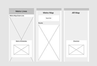
We sketched out our initial design based on how the application was going to be used. It helped with understanding what the flow of the application was going to be and helped define a skeleton for it. There were two main functionalities, Maps and Routes.”Maps” would give you the ability to navigate your way in and out of the metro station in 2 ways using AR or live location. “Routes” on the other hand would define a path once you’ve selected a destination and based on your current location , it would tell you which metro station is the closest to you and give you a schedule for the upcoming metro trains.

Lo-Fi Prototypes
We sketched out our initial design based on how the application was going to be used. It helped with understanding what the flow of the application was going to be and helped define a skeleton for it. There were two main functionalities, Maps and Routes.”Maps” would give you the ability to navigate your way in and out of the metro station in 2 ways using AR or live location. “Routes” on the other hand would define a path once you’ve selected a destination and based on your current location , it would tell you which metro station is the closest to you and give you a schedule for the upcoming metro trains.
Hi-Fi Prototypes


Usability Testing
We shared our prototype to users within our vicinity. Here are the results:
-
Users found to be slightly confused when moving from the map to the search route feature
-
Users highly favor the time estimate and marked it useful
-
Users did not recognize that tapping in the map could lead to an autofill in the search bar.
-
Improvements that could be made in order to refine the design:
-
Introduce useful features to new users (how to interact with the map, how to start a new search, reveals features that are too subtle to notice etc.)
-
More user-friendly features should be added
-
“Home” button should be added to the button menu for quick actions
-
Saving recent search history helps users browse the app without interrupting a planned trip
-
-
Reflection
COVID-19 is a major game changer in this project.
Our initial testing plans involved interacting with users and observing the way they interact with this application. Based on their input, we would make changes to the interface to make it easier to use. Instead, we sent the prototype to friends and asked for their input. Following the advice and input we received from our tests, we made minor tweaks to the application's interface.
“Design creates culture. Culture shapes values. Values determine the future.”
Robert L. Peters, Graphic Designer
